
With the new title, the freshly designed reversible logo, and an eerie, badass cover including newly designed and unbelievably hip uniforms New X-Men 114 announces loudly its commitment to shaking up the status quo. Everyone is fantastically tall and lanky, like runway models (Quitely characters don’t often look this thin). Inside Xavier will say of Cassandra Nova “are these words from the future?” and Morrison’s aim is to make the whole book feel like an artifact from a future time.
Turn the page and you get hit with a wonderful two page spread that economically introduces the whole X-Men concept to the kinds of new readers Morrison was after (see my earlier post on Morrison’s New X-Men and Cool -- just hit the New X-Men tag): Mutants will replace humans as humans replaced the Neanderthals. If you already know the concept your attention will be held by the bizarre and wonderful Cassandra Nova, a herald of a dark future who (in a design stroke of evil genius) wears a pith helmet and matching attire – she will kill mutants as the British upper class killed elephants in Africa on Safari.
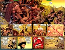
Turn the page again, and you get hit with an even better two page spread. Each main character gets an extreme close up highlighting a unique detail: Cyclops’s visor, Jean’s surgically precise telekinesis, Emma Frost’s high collar, the Beast’s cat eyes and glasses, Wolverine’s claws emerging (you can see small drops of blood flying, a detail that was removed from the poster version), and Xavier’s weird eyes, gleaming with one red and one blue X-Men logo, his dream. Even the font for the title card looks good.
This is part one of two because I want to keep posts bite size. More next time. Future reviews will be one post per issue; because a discussion of the first issue has to take into account all the new designs, it is a double post.


13 comments:
Cool, Geoff. I can't tell you how much I'm looking forward to reading your thoughts on this run. I'm also in the process of working my way through Morrison's run on the X-Men, but I'm just gibbering nonsense in my usual fashion. It will be a pleasant change to get some, y'know, actual insight, rather than mindless jokes about Prof X's blowhardiness.
What kind of frequency are we talking about, Geoff? It's now 3 years (pretty much to the week) that I was introduced to Morrison's X-Men and it brought me back to mainstream comics and has kept me there since. I read the whole run about twice a year - I love it that much. Not blind to its faults, but nothing touches it on most counts.
Here's to the whole run!
"I can't tell you how much I'm looking forward to reading your thoughts on this run."
So say we all!
I can't wait.
Dan: Don't sell yourself short. Your site is great fun. Speaking of which on Friday remind me to add you to the links on the right.
Marc: I am going to do it, I would guess once or twice a week depending on topical things I have to say. Let me emphasize that right now I do not know how this will go. It may only last a short while; it is an experiment at this point, to use the blog format to try something bigger. Let me also warn you that while there will be a lot of gushing about issues drawn by Quitely, there will be sustained bouts of unpleasantness (which actually drew me to writing about this book because I get to praise and damn).
Thanks Stephen and Mitch
Everyone: feedback is vital for this to work; especially if it gets old, you must tell me.
Reading over this again I noticed a stock Morrisonism: the line "Are these words from the future?" and particularlly your "artifact from a future time" statement, Geoff.
In at least three of Morrison's works (The Filth, later on in New X-Men, and in All-Star Superman) he makes reference to building a headquarters for the future in the present. I have nothing else to say, except that Morrison and co were already playing to his strengths, in the design and concept of the first issue.
Hey, as I've said before, I don't even really like Morrison or Whitely, and even I'm looking forward to reading these reviews.
Maybe they'll even convince me to read the issues themselves!
Mitch: yeah, that seems to be Morrison's motto and it is a pretty good one. The fact that the X-Men are the next step in evolution here now should have made this his perfect book. We will study what happens next.
Jason: if only to follow the controversy! I have a hunch I am going to loose half my myspace friends after I get to issues four and five.
I remember being totally blown away by this issue. X-men had been totally stagnant--I believe--for over ten years prior to Morrison's stuff. The island with all those insect Sentinals (was that in the first or second issue?) made everything new again. I remember thinking how fresh the series was--suddenly--that nothing this new had been done on the series since the Claremont/Byrne that was republished in the Classic X-Men series I read as a child.
I appreciate your post thanks for sharing the information.
Very Interesting and amazing how your post is! It Is Useful and helpful for me That I like it very much.
This is a really good.
The content you create has always caught my attention.
Post a Comment